
Welcome to the brand new version of the CoffeeGeek website, a planning and design process that started in June, 2023, and really picked up steam post Christmas season. It’s the main reason we’ve been so light on content the past two months.
An important note: there are some incomplete articles as we launch this new version of CoffeeGeek. This includes reviews, first looks, snapshot reviews and our how-tos that are older than 2 years. Also, our Opinions section needs some work to bring every article up to our new design. This work will be completed in the next few weeks. If you are reading these older files, and notice something’s amiss, they will soon be completed.
While we don’t have the resources or (frankly) the design chops to do a glitz roll out and announcement like Metalab did on their very recent redesign and re-branding, I’d still like to take you through the changes we implemented and queue up what’s yet to come.
But, if you know me and my style, gotta get to some (brief) history first!
What Was Before
When we launched the entirely top-to-bottom redesign and restructuring of CoffeeGeek almost exactly 3 years ago, we had a lot to learn about how the Internet and content management systems (CMS) worked in the 2020s. Though I think overall we did a pretty good job and introduced a very fresh and vibrant new interface, we also struggled a lot with things behind the scene.
For instance, we promised to bring back our long-run community features with the new website within six months of that 2021 launch. But that did not happen. Technically, we could not do it with the way we set up our back end CMS system. And I can tell you, it frustrated me every single day since then.
Also, while the 2021 redesign became a lot more mobile-friendly, it still had some major issues on displays like iPhones, Android devices and even tablets. We would fix them here and there, but a lot of it was of the band-aid kind of fix, not something elegant and permanent.
The third issue was accessibility. Our entirely new build scored very poorly in some regards for overall accessibility for folks with vision issues or other disabilities. This had to be fixed.
The fourth, and for our visitors the most important issue, was site speed. It was horrible, especially on mobile. The problem was how much bulk we added to the website on the back end as we tried and re-tried various design tricks and layouts. A lot of it added to massive bulk, including a humongous CSS style file downloaded with every page.
Again, we managed to improve site speed and other elements with various tricks, including migrating to much faster, much larger server, but it was a lot of band-aids holding things together.
We had to fix this. We also had to address certain design choices we made that just didn’t make sense for this website. So the CoffeeGeek 2023 (now 2024!) project began in June, 2023, behind the scenes.
CoffeeGeek 2024: What’s New
There’s just as much new behind the scenes on this website as the visuals you see up front. I won’t bore you with the back end details, except for one salient point:
We now have the structure in place to re-introduce our community features. And I really hope we can begin working on that this summer, but it is contingent on several factors, including the website’s overall operating budget, health, and income. I will cover this a lot more in a future blog post.
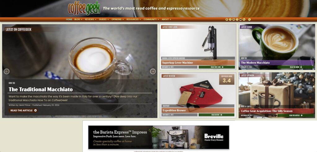
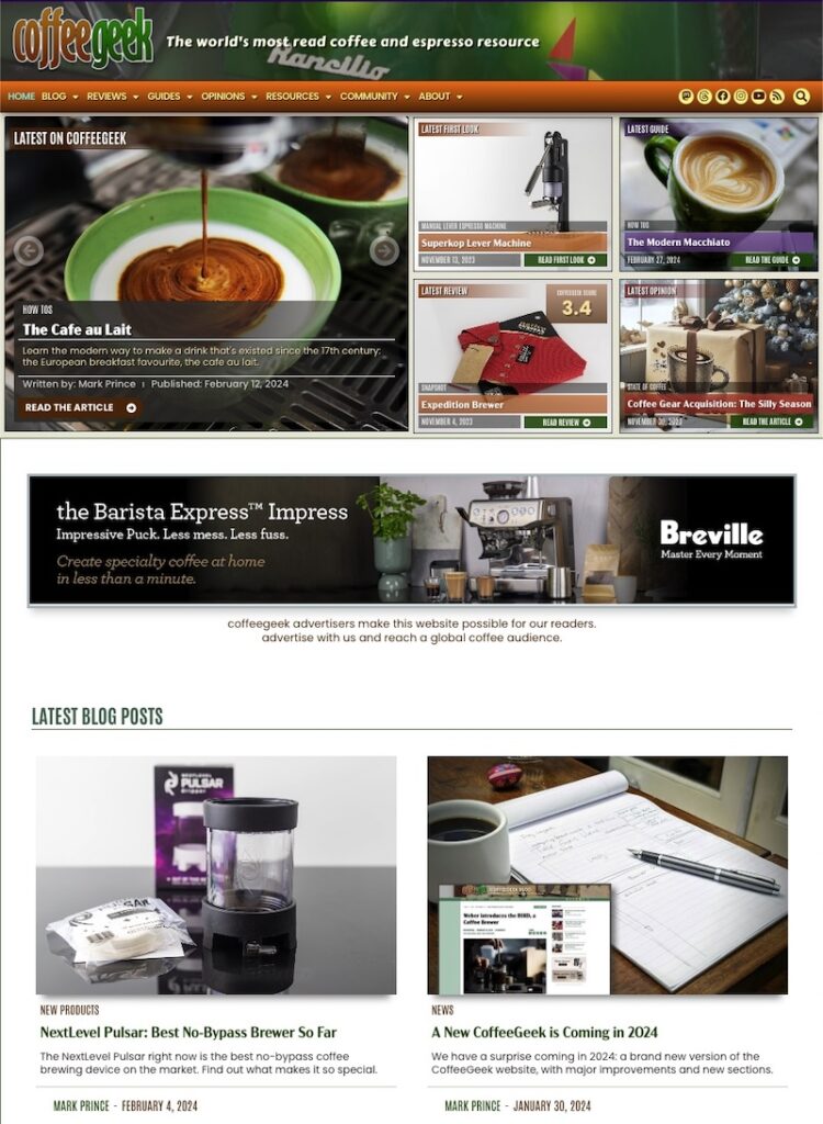
As for the visuals – what you’re seeing as you stroll through this website – well, not only is every single page coated with a new design, but we even have new sections and content! Let’s go through all of it, starting with a site overview, then a walk through each section.
Site Wide
The responsive nature of our entire website has improved dramatically with this new design. Whether you’re reading on your iPhone, or on a 5400 pixel wide ultrawide screen, things should look proper and fitted to your display. We’ve also gotten our Accessibility rating for almost every page up to 95 points or higher, something I’m very proud of.
Our new website and underlying CMS is fine tuned for speed too, especially considering how design-rich this interface is. We’ll never hit 100 points in Google’s page speed tests, but we routinely score near 90 points for most pages on desktop (long form pages like our reviews are in the 50-65pt range), and around 75pts for mobile. Still not perfect, but way better than the sub-50 points (20pt for mobile) basic blog pages scored on our old design.
We’ve settled on five fonts for the entire website, using a maximum of 3 on any single web page. This is about 1/3 the fonts we used on the old design. We no longer use external font sources (like Google Fonts), and instead self-host all our fonts, including some we’ve bought licenses for.
The fonts are organized in three sets overall: a formal set, used in our Opinions section, a semi-formal set used in our Detailed Guides, Detailed and Full Reviews, and an informal set used everywhere else.
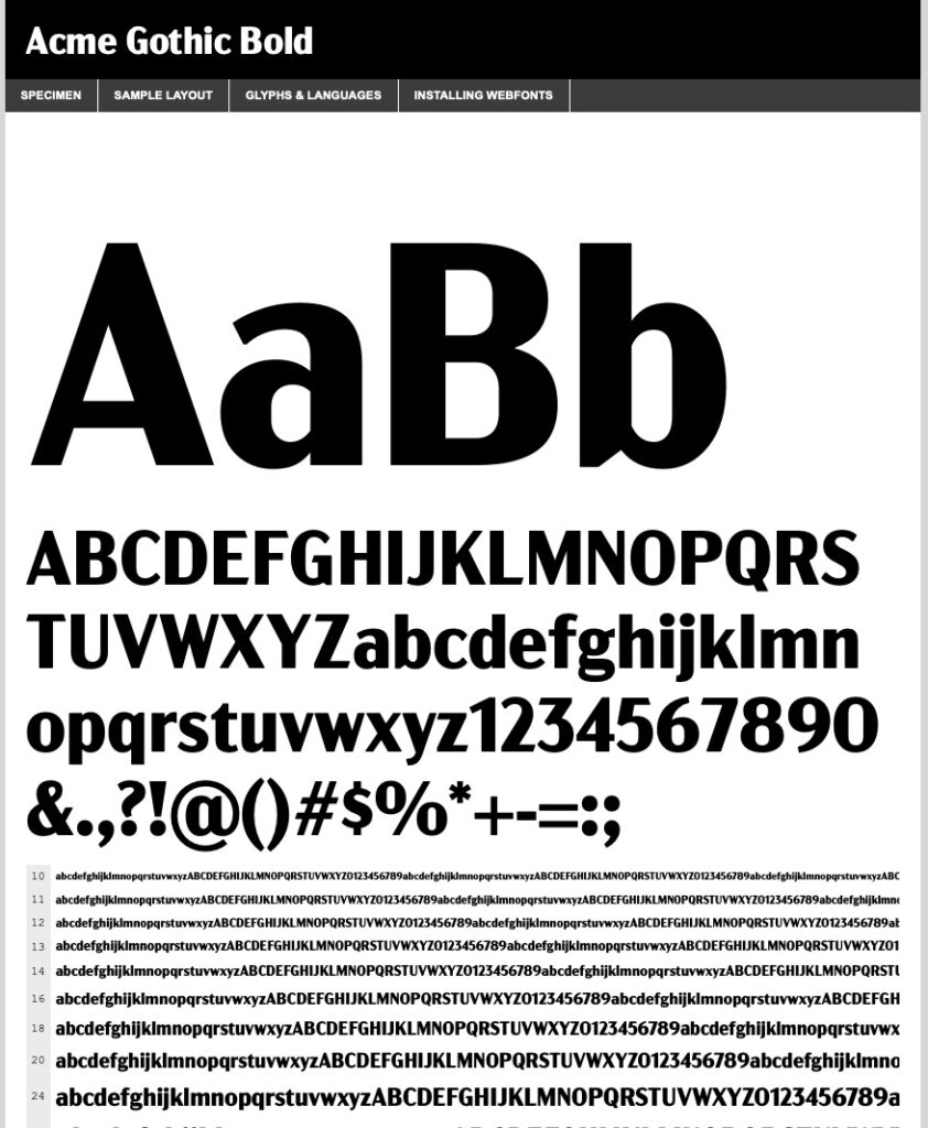
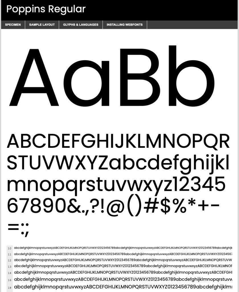
The fonts I’ve chosen have a personal tie in to my past personal and design life. We’re bought a license for Acme Gothic, because it has a wide range of fonts available and it’s design inspiration is the ACME logo from Roadrunner cartoons (which happened to be my favourite cartoon as a child). We use Acme Gothic in most titles (except in Opinions), and make use of its standard, condensed, and compacted versions.
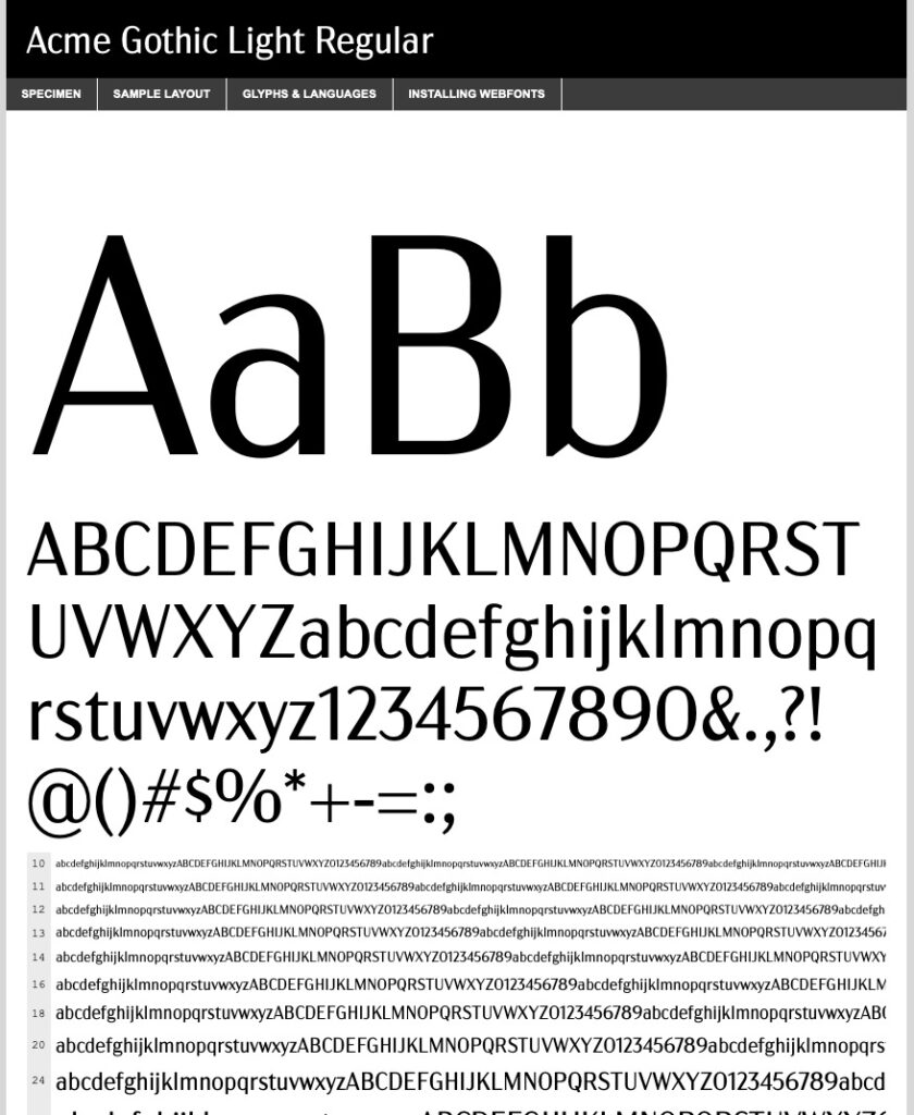
Our main body font everywhere except for Opinions is the Poppins font. Poppins is a sans serif font that is very readable at almost all sizes, and there’s a wide range of weights available. But that’s not the only reason I picked it.
When I first learned desktop publishing and graphic design in the 1990s, my go-to font for design work was ITC Avant Garde. I used it millions of different ways. I loved that font. I considered licensing it for this 2024 version of CoffeeGeek, but the open source Poppins font is so close in style and design, I opted for that instead.
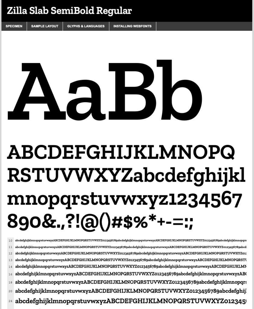
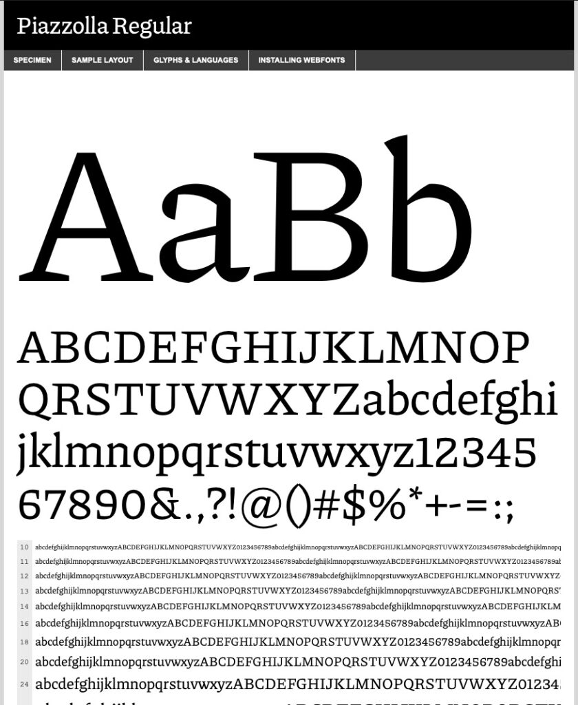
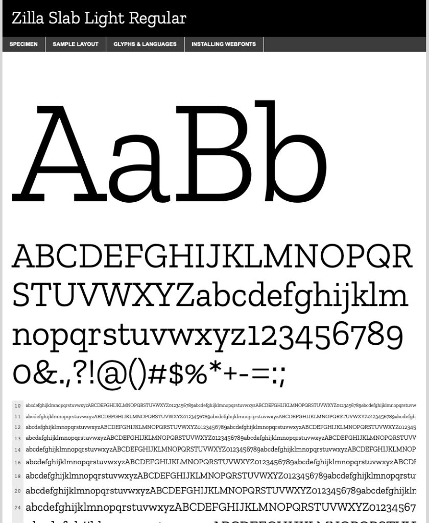
For our Opinions Section (and our forthcoming Detailed Guides), we’re using Zilla Slab as our title fonts, and Piazolla as our body font. I hope its serif design conveys a bit more of these sections’ “seriousness”, but Piazolla’s slightly whimsical letter build says we’re still having fun.
CoffeeGeek also has four ‘breakpoints” for display now. What is a breakpoint? It is a cue in our site design to know when to modify the design depending on the device it is displayed on. Most responsive websites today have three breakpoints: mobile, tablet, and desktop. We have fourth: widescreen. If you’re viewing this website on a high resolution widescreen display, max it out and see what I mean.
We also took our responsive design a step further by using variable height sizes for a lot of the landing page images you see, when you are reading a product review, opinion article, or how to guide. If your browser window is 1500px tall, the layout is going to be very different when compared to a browser window that’s 800px tall.
Lastly (because I’m getting far too deep into the design geek pool here), we designed CoffeeGeek to be very fluid in how its design stretches and fills your browser window, but started at a base of 1300 pixels for desktop viewing (which is larger than the typical 1100px most web designers use currently). The trick we achieved with our design is, if your desktop browser is not 1300px wide, our design shrinks dynamically to perfectly fit the window you’re viewing in. But if you go past 1300px, it looks even more spectacular.
Now let’s get into each major section.
The CoffeeGeek Blog
We did a pretty big overhaul of the look for the Blog. We wanted it to be more readable, but also more concise, a trick to achieve. The posts are easier to read, fit wider on the screen, and showcase images and videos better. We’ve also included reading time indicators, and make it easier to find other content via our category listings on most of the subsection pages. Finding authors is easier too now.
Here’s how the main Blog page, a typical Blog Category page, and a typical Blog Article looks like.
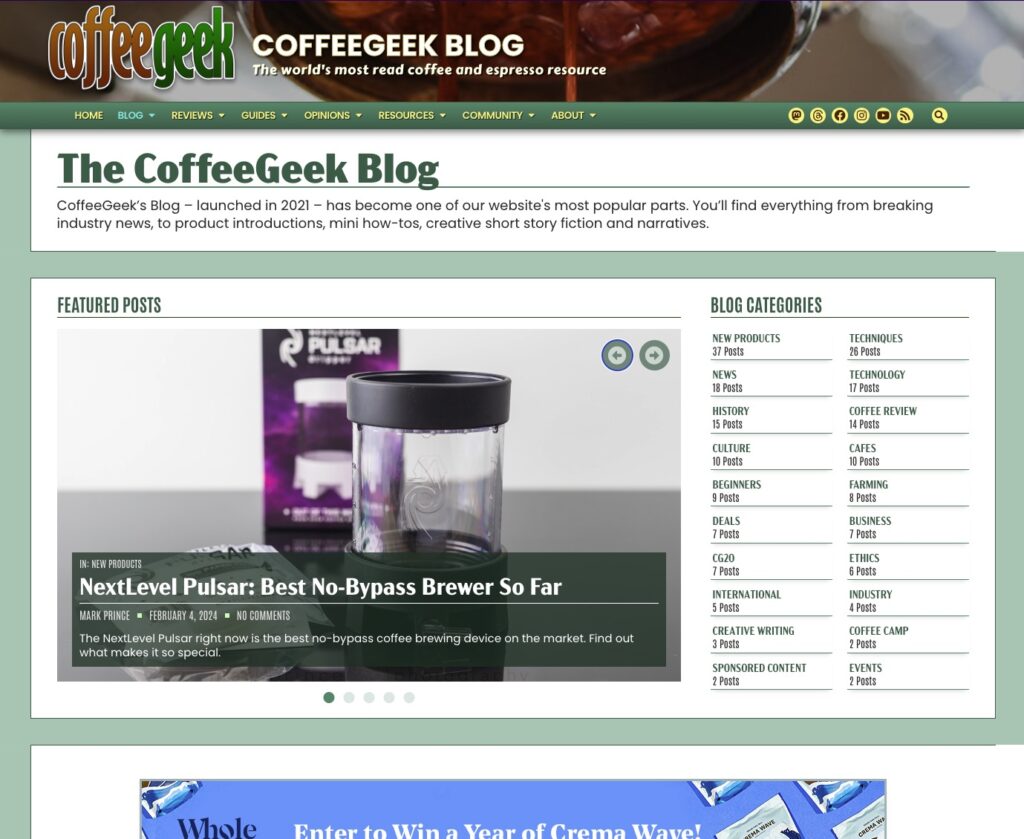
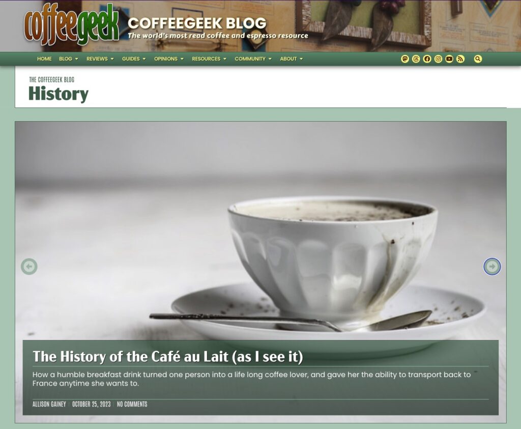
The Blog’s primary colour is hunter green.
CoffeeGeek Guides
Our very popular guides section got a full design overhaul, and also gained a new section: the Feature Guide. We hope to roll out an even more mega guide section later this year: the Detailed Guide. What’s’ the difference?
Feature Guides are still single page articles. Detailed Guides will be multi-page articles.
Our Feature Guides will encompass best-of buying guides (all written by real people, no AI generated, SEO optimized crap here), masterclasses on single brewing methods, and beginner guides on all aspects of coffee and espresso.
Detailed Guides will also be of the masterclass variety, but way more in depth, covering very advanced techniques and information.
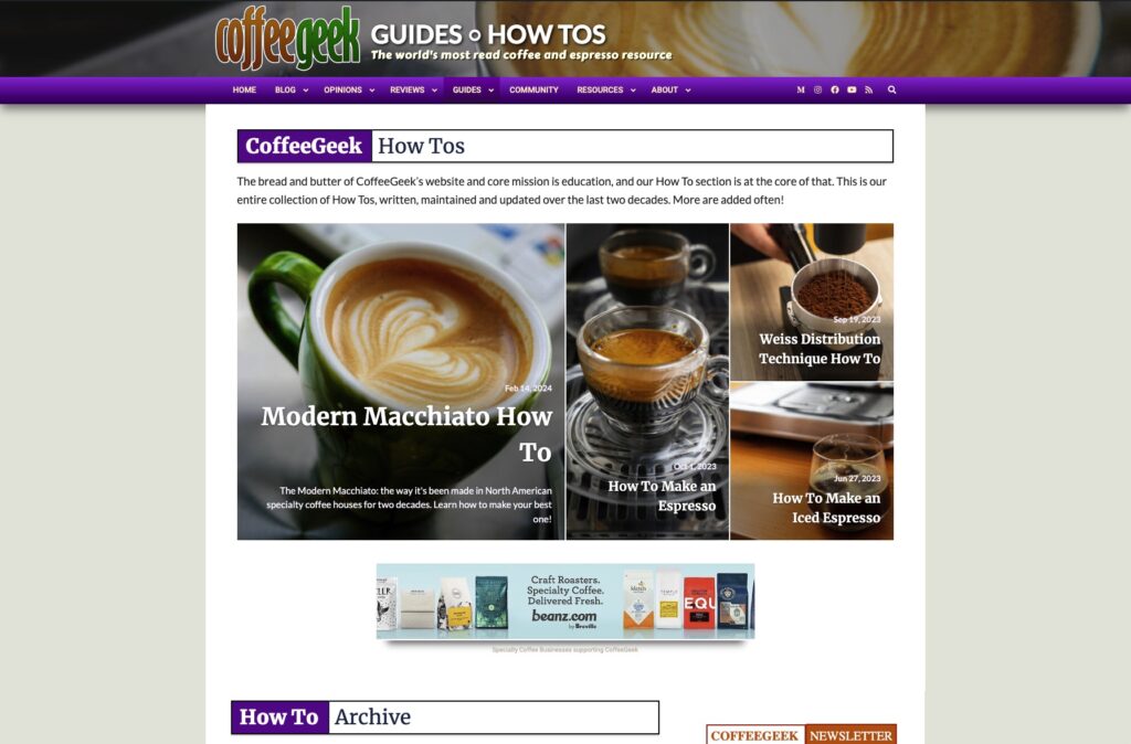
Of course, our extremely popular How Tos remain, and got their own refresh. They are now easier to read than ever, and play nicely with the restraints and requirements search engines like Google place on sites like ours for educational how to layouts and presentation.
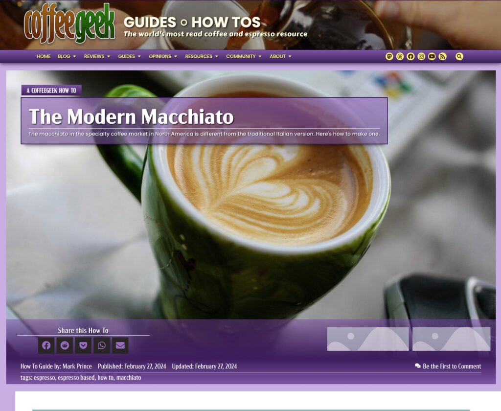
The Guide section’s primary colour is a dark muted purple.
CoffeeGeek Reviews
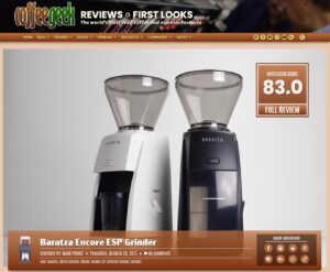
Like our Guides section, Reviews has a brand new category introduced with this redesign: the Snapshot Review. We’ve also rebranded our Quickshot Reviews as “Full Reviews” now. And the Detailed Review, a favoured feature on CoffeeGeek prior to 2018, is coming back.
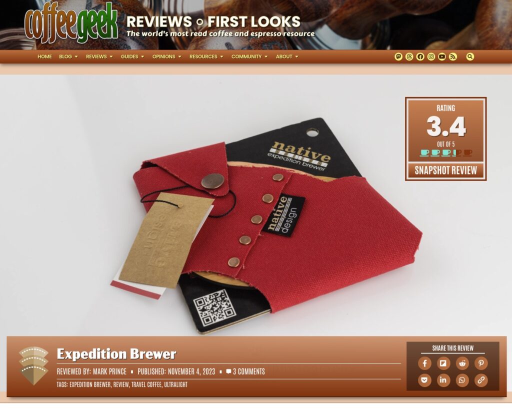
Snapshot Review are replacing the “Mini Reviews” we posted in our blog from 2021 to early 2024. They are more formal, with a scoring system and a proper review structure we’ll follow when reviewing products for that category. They also allow us to build up a proper comparison engine for reviews, something we’re also working on for later this year.
Speaking of that structure: I am still developing it, but Snapshot Reviews are designed to get reviews out about products fast. Much faster than our more formal Full Reviews. They aren’t meant to be all encompassing, exhaustive reviews, but a quick and honest take on coffee products and accessories in the more economical range.
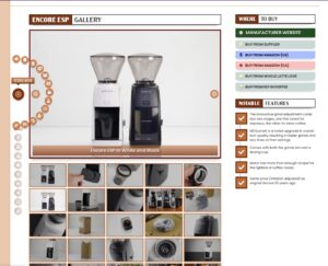
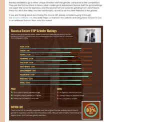
Full Reviews are the evolution of our Quickshot Reviews. Again, the structure’s been refined, and only a certain calibre of product qualifies for consideration for our Full Reviews, because each one takes several hundred hours of work. We’ve also evolved our rating system for these reviews, coming up with ten data points, each scoring from 0 to 10 points in half point increments.
In fact, two of those new data points are very unique: Resale Value, and Service/Warranty. Both of these are very important in your purchase decision for a product costing $500, $1,000, $5,000 or more, and we score them to demonstrate that importance.
We are looking to scale back the breadth of our Full Reviews a bit. This is both so we can produce them faster, but also save the truly in depth, exhaustive, every angle look at a product for our revived Detailed Reviews. Those will be multi-page reviews, covering every aspect possible of certain coffee and espresso products down the road.
First Looks also got a major overhaul. They look a bit different from other reviews, especially with the landing page area.
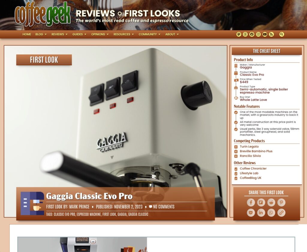
Keen eyes may notice something very few review websites do: we list other reviews on other websites, for you to check out. We’re doing this because you deserve as much information as you can get on an expensive product decision and because we want to promote long form content online. We do have our own rules about these listings: independent websites are given priority for listing (for instance, we’ll only list sites like CNet or Wired if no independent reviews exist), and we won’t list video reviews. The YT influencers get enough traffic already.
Also, we’re looking to really dial down the content in our First Looks. For years now, they’ve become pseudo full reviews (some are 5,000 words long!). We will be working overtime to dial them back to true first looks, giving you an initial product walk through, some initial thoughts based on very limited usage, and not much more. I hope with this change we can get back to publishing new ones with greater frequency.
The Reviews section primary colour is a muted burnt sienna.
Opinions
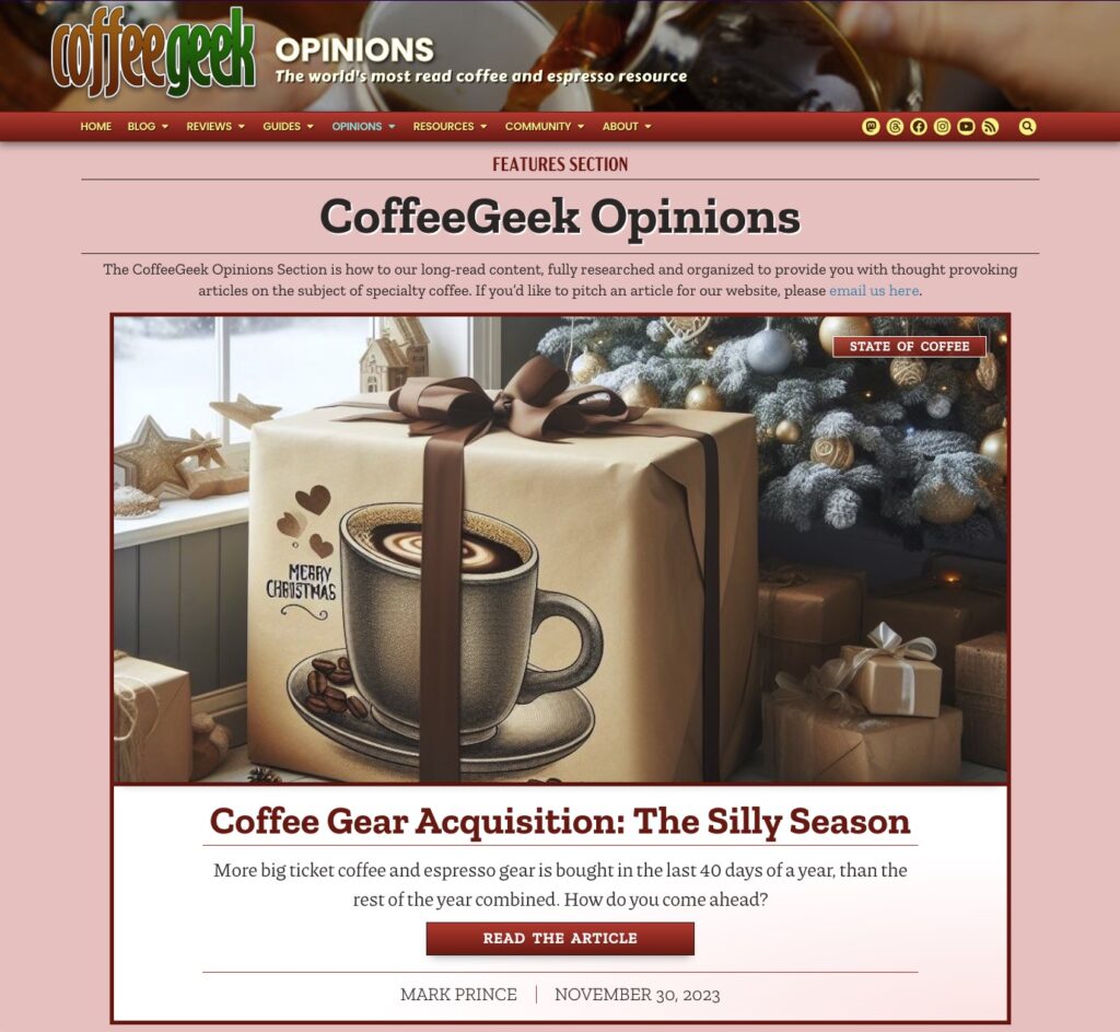
Time to be 100 here. The Opinions section isn’t where I want it to be. It’s because I can’t afford to pay proper columnists a decent enough amount to come on board as regular columnists, working on a regular publication schedule.
My long term vision for our Opinions Section is that we’d have a dozen experts in various areas of coffee writing a weekly or bi-weekly column. Much more formal and regimented than our blog posts. I thought it would be an ideal platform for a senior Roaster, or a professional coffee educator to use (to use just two examples), not only to share their knowledge but also to gain new customers and clients for themselves.
But it hasn’t panned out that way.
I’m not giving up hope yet, and we did expend a fair amount of resources and money to update Opinions for the 2024 build, but it is what it is.
So I’m putting this out there: If you are someone who has a lot to say about coffee and espresso, and you’re finding your Medium or Substack audience isn’t very big, consider bringing your skills and knowledge to the CoffeeGeek website and setting up a home in our Columnists section.
We will promote your expertise and feature you all over the place, from our newsletters to our social media channels. Your voice will get out to over 20,000 newsletter subscribers, and our daily visitor count of around 22,000 people. We can’t pay a lot, but I guarantee we can pay you more than you’re getting from Substack or Medium right now, and your audience would be 10-20x bigger. If you’re interested, our Contact Page is the way to get in touch.
The Opinions Section primary colour is a dark red.
Resources Section
I have some big plans for our Resources section, which I’ll save for another opinion article once we get closer to launch. Suffice to say, it’s going to be home to a lot of authoritative information, including FAQs, resource guides and more, for specialty coffee.
For now, it is the home of our Newsletters, the Coffee Pulse, and the Espresso Pulse.
…and the Community Section
It is coming. For real this time. We rebuilt the entire back end of this website just to make it possible. Stay tuned.
A Work in Progress
While hundreds of hours of testing and refining went into this 2024 redesign of CoffeeGeek, I know there’s going to be growing pains and issues that we will continue to resolve. Also, I made the decision not to fully migrate over all our content to the new design in time for launch. But it will all be migrated over, eventually.
For instance, our Reviews and First Looks are so complex in their design structure, all have to be migrated manually, “by hand”; I made the decision to only migrate over the most recent 10 in each category for launch, and my team will migrate over the remaining legacy reviews over the next month. This is why some of our older reviews appear incomplete.
The same goes with our How Tos, and older Opinion articles.
With this new site launched, our priority shifts back to producing new content. And a lot of it is going to come out in the next few weeks. Our blogging team has over a dozen articles on tap, and we have half a dozen First Looks ready to roll out.
If you do find any technical issues with this new design, or have requests for new types of content (or just want to comment on the new design), please feel free to reach us either through social media channels (links at the top of this article, as well as below) or fill out our contact form.
In the meantime, I hope you enjoy the new website! Ping me on Mastodon or Threads with your thoughts on what you see here.


One Response
Phew!
Congratulations! This was a long time coming. At first glance it looks great. There’s some familiarity with the look and it still very much feels like Coffee Geek but maybe a little more friendlier, as in user friendly.
I’ve red the review of the Orb One and had issues with the captcha, it just did not show up. I have not gone back yet, but will try again.